Still Life
Duplication of a 'Paul Cezanne' still life painting.
This is the original painting done by 'Paul Cezanne', i have chosen to recreate this image as i like the use of different colors. I also like the distinct brush marks which are shown with in the painting.
Above is a screenshot of me re-scaling the apples to a reasonable size to fit within the digital painting. I did this as it would look a bit odd if you had three huge apples on a small plate.
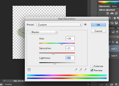
Above is a another screen shot of adjusting the hue and saturation of the plate to match the color of the plate in which i am trying to duplicate.
I have used the sprayed strokes filter on the apricot duplicate. This gives the apricot a rough look with an almost like brush stroke to it.
Here is a print screen showing that i have used layers to make up the complete final digital painting. I created layers by clicking the 6th icon from the left.
Final Digital Interpretation
Above is my final digital
painting, I created multiple layers and placed all the elements of the original
painting on a white background, in which I had found on the internet and edited
them. I found the process quite difficult as trying to match the color on the
original image is very hard to match. Also the layers confused me at first but
then after a few minutes I got used to using the layers. I also found the
process very time consuming, as I had to spend time on the editing of each and
every element in the image. I think that my strength of this project is the
fact that I positioned them well and arranged them well to the position of the
original, however the actually editing process of each element I found
difficult and, I feel that they do not duplicate the original in the slightest,
so therefore feel that this is my weakest part of this whole project. If I
could do the work again I think I would take more care on editing the images
and possibly seek advice on how to edit them in a proper way to make them look
real.
The Figure
Tonal Self Portrait
to create these two self portraits i had to set the image to 'Greyscale' then created a layer, however used the lasso tool in photoshop to get rid of the background, then i selected different tones of my face and changed the color to grey. I did this in another layer, i then selected more o the image and made this part a dark color to create a three tone image. I like the texture of my jumper and hoodie, i like how to cloth has created two tones where the jumpers a knitted. the process was quite confusing at first but then after a couple of times i got used to it and i didn't find the process to difficult. If i was to do the work again, i think i would make sure that my actual face on the second image had more tonal quality to the image as my face is mainly grey.
Experimentation with shapes.
Above was our first lesson in completing shapes, I've never used illustrator before so i thought it would be a good idea to do some experimentation using tools to draw shapes, just so then i could get used to using illustrator.
I completed the above on the second lesson, i used the pen tool as i did on the first one, but i made the shapes more accurate, apart from the circle as that was quite tricky in developing however it sort of looks like a circle i guess.
This is a print screen showing that i have used different tools within illustrator to create different shapes. I used the dialogue tool, pen tool and the shape tool. The dialogue and shape to were the easiest to use as the dimensions and proportion were easy and already done in the case of the shape tool. within experimentation i used the fill and stroke to add colors within the shapes.
In order to create these shapes i used the shape tools in the path finder pallet.
Duck Drawing
In order to complete the drawing of the duck i used the pen tool and then curved the lines to create a more rounded to give it a more duck like shape. I did this by joining the dots, basically like a dot to dot, just testing and experimenting within illustrator.
Final Drawing
This is my final digital drawing. I used the template originally and then, created multiple layers in which i worked on in order to build up the drawing and enhance the drawing. It is still yet incomplete.
The different between direct selection and selection are that with selection you select the area or the shape and with direct selection you can select an individual line or point.


No comments:
Post a Comment